
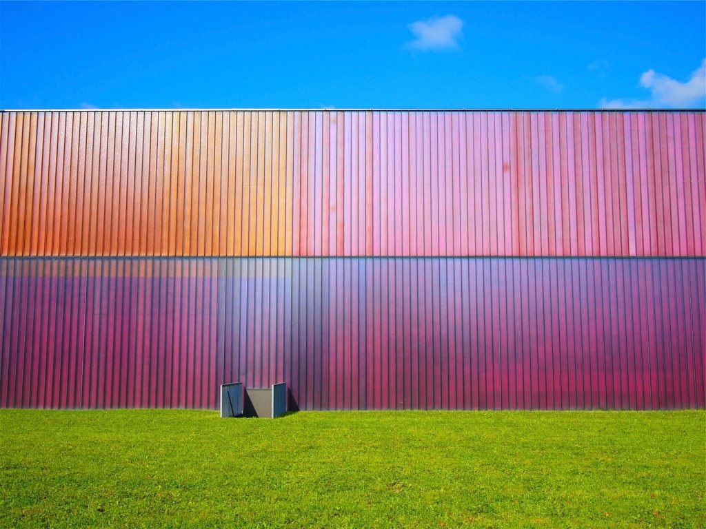
Most of us learn exposure first, then composition, and only much later, if ever, do we learn colour. Yet colour is the thing a viewer registers before anything else, before the subject, before the light, before they even know what the picture is of. A frame with two or three colours that belong together feels finished. A frame with eight colours that arrived by accident feels like a snapshot, no matter how good the moment. We have come to believe that most of what separates a strong colour photograph from a weak one happens before the shutter, in the decision about what to leave out.
The wheel, briefly
Painters have organised colour on a wheel for centuries, and the wheel is still the simplest map for photographers. Colours opposite each other are complementary: blue and orange, red and green, yellow and violet. Placed together they intensify each other, which is why a warm streetlight against a blue evening sky feels so alive. Colours next to each other are analogous: the run from yellow through orange to red, or from green through teal to blue. Placed together they feel harmonious and calm.
A photograph does not have to follow either scheme, but it helps to know which one you are in. A scene of autumn leaves is analogous, and adding a blue jacket to it introduces a complement that will dominate the frame whether you want it to or not. A blue hour cityscape is complementary by nature, and the best ones keep it to exactly those two families with nothing else intruding.
Beyond hue, two other properties matter as much. Saturation is how pure or greyed a colour is. Value is how light or dark it is. A picture can hold a dozen hues if they are all low in saturation and close in value, because they read as one family. It can barely hold two if both are fully saturated and one is light and the other dark.
Harmony: fewer colours, more relation
Harmony in practice usually means restraint. Look at the colour work that stays with you and count the hues. It is rarely more than three, and often the third is a small accent. Our working target is a dominant colour that covers most of the frame, a secondary colour that supports it, and at most one accent that pulls the eye. A green field under a green-grey sky with one red barn. A sand beach under a pale sky with one blue umbrella. The accent is heavy precisely because it is alone.
Harmony can also come from a shared cast. Late sun turns everything it touches amber, and a scene that would be chaotic at noon becomes unified because all its colours have been pushed toward the same warmth. Fog does the same thing in the opposite direction, greying and cooling every hue until they belong together. Photographers sometimes reach for a tint in editing to force this unity, and a light touch of it can work, but it is far more convincing when the light did it.
Value harmony is the quiet secret. If every colour in the frame sits at a similar brightness, the picture feels calm even with contrasting hues. Pastel schemes, where everything is light and desaturated, and moody schemes, where everything is dark and muted, both rely on this. The eye reads the shared value before it reads the differing hues.
Contrast: when to let colours fight
Contrast is the tool for energy and attention. Complementary pairs are the strongest, and a saturated complement against a muted field is the most reliable way to make a small subject dominate a large frame. Warm against cool works even when the hues are not exact opposites: any warm colour will jump forward from any cool one, which is why a person in a yellow coat reads as the subject on a blue-grey street without any help from focus or framing.
Saturation contrast is subtler and often better. One saturated element in an otherwise greyed frame is calmer than two saturated complements and still directs the eye exactly where you want it. A single ripe fruit in a muted kitchen, a red door in a whitewashed village. The trick is to keep the rest of the frame genuinely muted, because any second saturated area, however small, splits the attention.
Contrast should be spent, not scattered. If everything in the frame contrasts with everything else, nothing wins and the eye gives up. Choose the one contrast you want, and make the rest of the frame agree with itself.
Restraint at the moment of shooting
The colour of a photograph is decided mostly by what is in the frame, and that is a matter of pointing the camera. We spend a surprising amount of time walking around a scene to lose a colour: a step to the left hides a yellow sign behind a tree, a lower angle drops a red car below the frame edge, waiting thirty seconds lets a person in an orange jacket walk out. None of this is editing. It is choosing.
A few questions we ask before pressing the shutter:
- How many hues are in this frame, and can I lose one?
- Is there a colour near the edge that is more saturated than my subject?
- Do the colours share a cast, a value, or a family, or are they strangers?
- Is the background quieter than the subject, in colour as well as in tone?
Backgrounds deserve special suspicion. A subject can be perfectly chosen and still lose to a background of mixed signage, plastic chairs and a blue tarp. Moving the subject two metres, or moving yourself, is almost always possible and almost always the fix.
Restraint in the edit
The saturation slider is the most abused control in photography. Pushing it makes every colour louder at once, which destroys the hierarchy you worked to build in the field. If a colour needs help, adjust that colour alone and leave the others. More often, the better move is to pull saturation down on the colours that compete with the subject, so the subject stands out by comparison rather than by force.
White balance is a colour decision, not a technical one. A neutral white balance is correct in the sense that white objects look white, but it can strip a scene of the warmth or coolness that made it worth photographing. We set it for the mood we saw, not for the grey card.
Finally, look at the picture small. Shrink it to a thumbnail and check whether the colour relationships still read. If the thumbnail is a clear dominant with a single accent, the full-size picture will hold together. If the thumbnail is confetti, no amount of local adjustment will save it. Colour is decided early, and it is decided by leaving things out.