
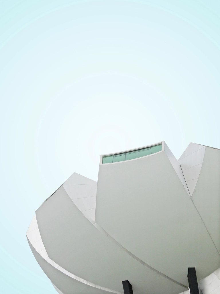
The rule of thirds is the first composition idea most of us learn, and for a while it works. Put the horizon on a third, put the eyes on a crossing point, and the picture looks tidier than it did when everything sat dead centre. Then, a few years in, we notice that the pictures we admire most break the rule constantly, and that some of our own frames obey it perfectly and still feel wrong. The rule was never the point. It was a rough approximation of something deeper, which is balance, and balance is what this article is about.
Why the grid stops helping
A three-by-three grid answers one question: where should the subject go? It says nothing about how big the subject is, how bright, how much it contrasts with its surroundings, or what else is in the frame pulling the eye in another direction. A small dark bird on a crossing point and a huge white sail on the same crossing point are not the same composition, even though the grid approves of both.
The grid also cannot tell you when to centre. A face looking straight into the lens, a symmetrical building, a reflection in still water, a single tree in fog: these want the middle, and putting them on a third just makes them look like they slipped. Once you see composition as a question of weight rather than position, the grid becomes an occasional helper rather than a law.
Visual weight, and what carries it
Every element in a frame has a weight, a pull on the eye, and the composition is the sum of those pulls. Some things are heavy almost by default. Faces and eyes are heaviest of all; we cannot help looking at them. Bright areas are heavier than dark ones in most pictures, with the important exception of a small dark shape against a light field, which becomes heavy through contrast. Saturated colour is heavier than muted colour, and warm is heavier than cool. Sharp things outweigh soft things. Text, if it appears, is heavy because the brain tries to read it. And anything near the edge of the frame gains weight simply because it threatens to leave.
Size matters, but less than beginners expect. A tiny red figure on a grey beach can outweigh the entire beach. That is not an accident; it is the basis of a whole genre of landscape work where one small human gives scale and pulls the eye to a chosen point.
A useful habit is to look at your frame and ask, honestly, where the eye lands first, second and third. If the answer is not what you intended, something in the frame is heavier than you meant it to be. Usually it is a bright patch in a corner, a hot sky, or an out-of-focus object with strong colour. Reframe, or wait, or move.
Balance is not symmetry
Balance means the weights in the frame feel settled, as if the picture would not tip if you set it on a pivot. Symmetry is the simplest way to get there: equal weights on both sides. Formal, calm, sometimes grand, sometimes dull. Most photographs use the other kind, informal balance, where a large or heavy element on one side is countered by a smaller but heavier-per-inch element on the other. A big soft cloud bank on the left, a small sharp lighthouse on the right. A large area of dark water at the bottom, a thin bright strip of sky at the top.
Think of a seesaw. A child far from the pivot balances an adult sitting close to it. In a frame, distance from the centre multiplies weight. A small element pushed toward a corner can hold up a much larger element near the middle. This is why a subject placed on a third often works: it moved away from the pivot, and the empty space on the other side became its counterweight. The rule of thirds is a special case of the seesaw.
Balance can also be deliberately broken. An unbalanced frame feels tense, unstable or unfinished, and there are subjects that call for exactly that feeling. The point is to break it on purpose, not by accident.
Negative space is not empty
The space around and between things has a shape and a weight of its own, and learning to see it is the biggest single jump in composition most of us make. Look at the sky between two buildings and see it as a shape. Look at the wall behind a seated figure and see how much of it there is on each side. In a strong picture, those shapes are as deliberate as the subject.
Negative space does several jobs at once. It gives the subject room and makes it read faster, because there is nothing competing. It sets a mood: a lot of space feels quiet, isolated or peaceful, while very little space feels crowded or intense. And it carries weight for the balance, as the counterweight on the seesaw. A bird in the top left of a frame with nothing else in it is balanced by the emptiness in the bottom right, and the emptiness is doing the work.
The classic failure is to put a moving or looking subject on the edge it is moving or looking toward. The eye follows the gaze straight out of the picture. Give the gaze somewhere to go, which means placing the space in front of the subject, not behind it. The same applies to a car, a runner, a wave.
A practical way to see it
You cannot calculate weights, but you can train the eye to feel them. Before pressing the shutter, try a few quick checks.
- Squint until the frame blurs into blobs of tone. Where are the bright and dark masses, and do they feel settled?
- Find the heaviest thing. If it is not your subject, move so that it is, or get it out of the frame.
- Trace the shape of the empty areas. Are they simple shapes, or a mess of slivers between objects?
- Check the edges. Anything touching or cut by the frame border grabs attention, so either include it fully or lose it cleanly.
After the fact, look at your best and worst pictures with the same eye. The good ones will almost always show a clear hierarchy of weight and clean negative shapes, whether or not anything sits on a third. The weak ones will usually have two elements fighting for attention or an accidental bright patch stealing the frame. Once you can see that, you no longer need a grid to tell you where things go. You can feel where they want to be.